








On this page
Find out what you're actually shipping
Open DevTools → Network, filter to Font, and hard-reload. You'll see every file, its size, and when it arrived.
The common result on a Webflow marketing site: six to ten font files, 300–600KB total, several of which are weights nothing on the page uses. A designer picked a family in the Designer, uploaded the full set because that's what came in the zip, and every visitor has downloaded all of it ever since.
Two numbers to write down: total font bytes, and how many distinct files. Both are usually reducible by more than half without a single visual change.
Weights: the biggest and easiest win
Each weight is a separate file. Each italic is another separate file. A family with Regular, Medium, Semibold, Bold plus italics is eight downloads.
Most designs genuinely use two or three. The rest arrive because they were in the upload.
To check what's used, run this in the console:
const used = new Set();
document.querySelectorAll('body *').forEach(el => {
  const s = getComputedStyle(el);
  if (el.textContent.trim()) {
    used.add(`${s.fontFamily.split(',')[0]} ${s.fontWeight} ${s.fontStyle}`);
  }
});
console.table([...used].sort());
That lists every family/weight/style combination actually rendering text. Compare it against what's loading. Anything loaded and not listed is pure waste — remove it from Site Settings → Fonts, or from your Google Fonts selection.
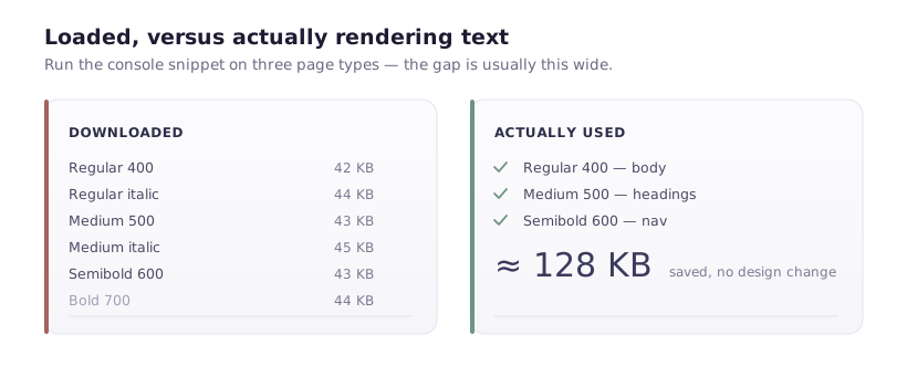
One caution: run it on several page types, not just the homepage. A weight used only on blog posts won't appear if you test the pricing page.
Faux styles. If you drop the Bold file but keep font-weight: 700 in the design, browsers synthesise a bold by smearing the regular weight. It looks noticeably worse — muddy at small sizes. So either keep the weight or change the design to use one you kept. Don't drop a file and assume nobody will notice.
font-display, and why the default hurts
By default, a browser hides text while a custom font loads — a blank space where your headline should be, sometimes for seconds on a slow connection. That's a flash of invisible text, and it directly damages LCP when your largest element is text.
font-display: swap renders immediately in a fallback and swaps when the custom font arrives. Text is visible the whole time.
For Google Fonts, add &display=swap to the URL:
https://fonts.googleapis.com/css2?family=Inter:wght@400;600&display=swap
For self-hosted fonts in Webflow, add a @font-face override in Site Settings → Custom Code → Head:
<style>
  @font-face {
    font-family: 'YourFont';
    font-display: swap;
    src: local('YourFont');
  }
</style>
The trade-off is honest: swap means visitors see a font change mid-load. That's a layout shift risk, which brings us to the next section — but visible text in the wrong font beats invisible text in the right one, every time.
Killing the swap shift
The shift happens because the fallback and the custom font have different metrics, so text reflows when the real font lands.
Two properties fix most of it:
@font-face {
  font-family: 'YourFont';
  src: url('/fonts/yourfont.woff2') format('woff2');
  font-display: swap;
  size-adjust: 96%;      /* scale the fallback to match */
  ascent-override: 90%;
  descent-override: 22%;
}
Getting the numbers right is fiddly by hand — the practical approach is to pick a fallback with similar metrics and adjust size-adjust until the shift stops being visible. Load the page with the network throttled to Slow 3G and watch the headline as the font swaps. If it doesn't move, you're done.
Also declare a sensible fallback stack rather than letting it land on Times:
body {
  font-family: 'YourFont', system-ui, -apple-system, 'Segoe UI', sans-serif;
}
system-ui renders in the operating system's own typeface, which is well-made, already loaded, and much closer in proportion to most web fonts than a default serif.
Preload the one that matters
Fonts are discovered late — the browser must parse CSS before it knows a font exists, then fetch it. For the font in your headline, that delay is on the LCP critical path.
Preload it, and only it:
<link rel="preload" href="/fonts/yourfont-600.woff2" as="font" type="font/woff2" crossorigin>
Two rules. crossorigin is mandatory even for same-origin fonts, because fonts are fetched in CORS mode — omit it and the browser downloads the file twice. And preload one or two files at most: preloading six tells the browser everything is urgent, which is the same as telling it nothing is.
Self-hosting versus Google Fonts
Webflow supports both. The performance difference is smaller than it once was — browsers stopped sharing font caches across sites years ago, so a Google-hosted font is no longer "probably already cached".
What remains:
Self-hosting avoids a DNS lookup and connection to a third-party origin, which is worth real milliseconds on first load. It also keeps visitor IPs from being sent to Google, which matters under GDPR — a German court decision made this a live compliance question, not a theoretical one.
Google Fonts is easier and provides optimised subsets automatically.
I'd self-host for any site with European visitors, on the privacy argument alone. The performance gain is a bonus.
Subsetting
A font file contains glyphs for many characters — Cyrillic, Greek, Vietnamese, symbols. An English-language site uses a fraction.
Google Fonts subsets automatically by declaring unicode-range, which is why its files are often smaller than the ones you'd upload yourself.
For self-hosted fonts, subset before uploading. glyphhanger or pyftsubset do this; a Latin-only subset typically cuts 30–50% off the file.
Be careful about what you strip. Removing the characters your customer names use — accented Latin, for instance — produces missing glyphs in exactly the place people notice. Latin Extended is a safe default for European languages.
The order I'd do it in
- Audit weights. Run the console snippet. Remove unused files. Usually the largest single win, and it takes ten minutes.
- Add
font-display: swap. Removes invisible text. - Preload the LCP font. One file, with
crossorigin. - Fix the swap shift with
size-adjustand a sensible fallback. - Self-host and subset if you have EU visitors or you're chasing the last hundred kilobytes.
Steps 1 and 2 take an afternoon between them and account for most of the available gain. Steps 4 and 5 are for when you're genuinely tuning.
And measure with the network throttled. On office broadband every font arrives instantly and every configuration looks identical — which is precisely why these problems survive so long.