








On this page
The pitch, and the honest counter-pitch
A CMS-driven menu means your navigation comes from a Collection rather than being hand-built in the Designer. Add a service, the nav updates. Reorder items in the Editor, the nav reorders. No developer, no publish cycle for a link change.
The counter-pitch: your main navigation probably changes four times a year. You're introducing a Collection, a nested list with a hard ten-item ceiling, and a rendering dependency on every page — to save four Designer edits annually.
So the decision rule is about volatility and volume, not elegance:
Build it CMS-driven when the menu mirrors content that already lives in a Collection (a mega-menu listing every product, a docs sidebar tracking articles), or when non-technical people need to reorder it regularly.
Hand-build it when the nav is five stable top-level links. Which, for most marketing sites, it is.
Structure
Create a Nav Items Collection with these fields:
Label(plain text) — what shows in the menu, which is often shorter than the page titleLink(link field) — external URL or internal pathOrder(number) — explicit sort controlParent(reference to Nav Items, optional) — for two-level menusOpen in new tab(switch, optional)
Then in the Designer, drop a Collection list into your navbar, sort by Order ascending, and bind a link block inside it.
Keep Label separate from any page title field. Nav labels want to be two words; page titles want to be descriptive. Binding the nav to page titles produces a menu reading "Webflow Apps & Products | FlowAppz" and someone will ask you to fix it.
Two-level menus, and the limit that shapes them
Dropdowns are where this gets constrained.
The natural model is a self-referencing Parent field: top-level items have no parent, children point at their parent. You then render top-level items in a Collection list, and each item's children in a nested Collection list filtered to that parent.
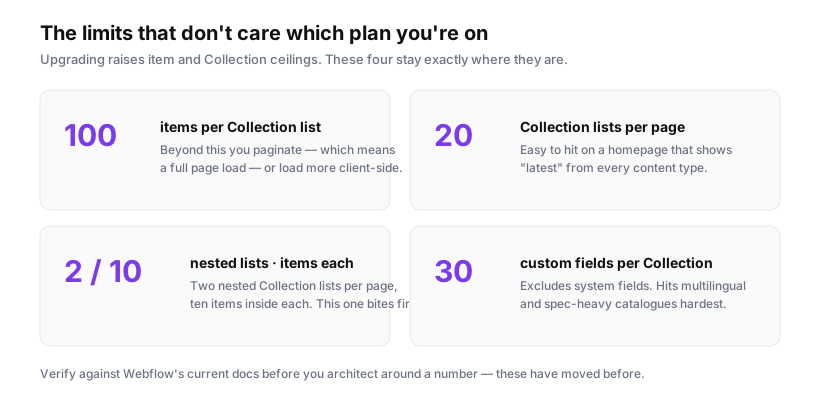
Which runs straight into the ceiling: a nested Collection list renders 10 items, and a page allows only two nested lists.
Ten children per dropdown is usually fine. Two nested lists per page is the binding constraint — if your navbar uses both, nothing else on that page can nest, and that includes the footer. On a site whose footer lists categories from a Collection, you'll hit this on day one.
Practical alternatives:
Separate Collections per menu section. A Services Nav Collection and a Resources Nav Collection, each rendered as a top-level list inside its own dropdown. No nesting, no ten-item cap, at the cost of Collection slots.
One flat Collection with a section field. Add Section as an option field, render one top-level Collection list per dropdown filtered to its section. Same result, one Collection. This is what I'd default to.
Hand-build the top level, CMS the dropdown contents. The five top-level links are stable — build them in the Designer. Only the long lists inside dropdowns come from Collections. This gets you the flexibility where it matters and avoids nesting entirely.
The current-page problem
Webflow's built-in "current" styling works on static links. It does not reliably apply to links rendered from a Collection list, because Webflow can't always resolve whether a CMS link matches the current page.
Fix it in JavaScript:
(function () {
  const path = window.location.pathname.replace(/\/$/, '');

  document.querySelectorAll('.nav-link').forEach(link => {
    const href = new URL(link.href, window.location.origin)
      .pathname.replace(/\/$/, '');

    if (href === path) {
      link.classList.add('is-current');
      link.setAttribute('aria-current', 'page');
    }
  });
})();
Two details worth keeping: normalise trailing slashes, or /services and /services/ will fail to match; and set aria-current="page", because a colour change alone tells screen reader users nothing about where they are.
For a parent item that should highlight when any child page is active, match on prefix instead of equality — path.startsWith(href + '/').
Four failure modes
Things that go wrong with CMS navs, in the order they'll bite you.
1. An unpublished item disappears from every page. Set a nav item to draft and it vanishes site-wide instantly. That's the feature working correctly, and it means an editor can remove your main navigation by accident. If the nav is business-critical, restrict who can edit that Collection.
2. A deleted linked page leaves a dead menu entry. The nav item still exists, pointing at a 404. Webflow won't warn you. Worth a quarterly crawl of your own navigation.
3. Sort order drifts. If Order is a number field, editors inserting an item between 2 and 3 need decimals or a renumber. Number in tens — 10, 20, 30 — so there's room to insert without touching everything.
4. The nav becomes a render dependency on every page. Every page now runs a Collection list to draw its menu. That's fine, but it counts toward the 20-lists-per-page limit, and it means CMS problems become site-wide layout problems rather than a single broken page.
Accessibility, which CMS rendering makes easier to get wrong
Hand-built Webflow dropdowns come with reasonable keyboard behaviour. A dropdown built from a Collection list inside a plain div does not — you get a list of links with no keyboard semantics.
The minimum:
<nav aria-label="Main">
  <button aria-expanded="false" aria-controls="services-menu">Services</button>
  <ul id="services-menu" hidden>
    <!-- collection list renders <li><a> here -->
  </ul>
</nav>
Toggle both aria-expanded and hidden together, make Escape close the menu and return focus to the button, and ensure Tab moves through items in visual order. If that's more than you want to maintain, use Webflow's native Dropdown component and put the Collection list inside it — you inherit the keyboard behaviour and only give up a little layout control.
When I'd skip it entirely
If your navigation is under about eight links and changes rarely, build it in the Designer. You avoid a Collection, the nesting limits, the current-state script, the accessibility rework, and a class of failure where a content edit breaks the site's navigation.
The strongest case for CMS-driven nav isn't the main menu at all — it's the long lists that already mirror Collections: a footer of all categories, a docs sidebar, a mega-menu of every product. Those genuinely change with content, and hand-maintaining them is the thing that actually wastes time.