








On this page
Why these recur
Webflow gives you complete control over markup, which means complete freedom to produce markup that looks right and isn't. Nothing here is a Webflow bug — every one is a consequence of building visually, where the accessibility layer is invisible until someone tests for it.
Ordered by impact on real people, not by how easy they are to fix.
1. Divs doing the job of buttons and links
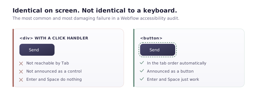
The most common and most damaging.
A div styled to look like a button, with a click interaction. Visually identical, functionally unusable: not keyboard focusable, not announced as a control, can't be activated with Enter or Space, invisible to screen readers as anything interactive.
Fix: use a Button element for actions and a Link element for navigation. If you must keep a div — say the design needs a structure the button element won't allow — you owe it all the behaviour:
<div role="button" tabindex="0" class="fake-button">Send</div>
el.addEventListener('keydown', e => {
  if (e.key === 'Enter' || e.key === ' ') {
    e.preventDefault();
    el.click();
  }
});
That's three additions for something the native element gives free. Use the native element.
Find them:
document.querySelectorAll('div, span').forEach(el => {
  const cursor = getComputedStyle(el).cursor;
  if (cursor === 'pointer' && !el.closest('a, button')) {
    console.warn('Clickable non-interactive element:', el);
  }
});
2. Images with no alt, or the wrong alt
Webflow leaves alt text empty by default, so it's absent unless someone types it.
Two failure directions. Missing alt on meaningful images means screen reader users get a filename, or nothing. And decorative images with descriptive alt — a background flourish announced as "abstract purple gradient shape" — is noise that makes content harder to follow.
Fix: meaningful images get alt describing their content and purpose. Decorative images get explicitly empty alt (alt=""), which tells assistive tech to skip them. In Webflow, set alt text in image Settings, or mark the image decorative.
CMS images need alt bound to a field, or every item in a Collection shares one description.
3. Heading levels chosen for size
Someone needs a smaller heading, so they pick H4 because it looks right. Now the page goes H1 → H4 → H2.
Screen reader users navigate by headings — jumping between them is the primary way of skimming a page without sight. A broken hierarchy makes that navigation misleading.
Fix: choose the level for structure, style with classes. If your H2 is too big, change the class, not the tag.
Also: exactly one H1 per page. Promo blocks reused across templates are a common source of a second one.
Check it:
let last = 0;
document.querySelectorAll('h1,h2,h3,h4,h5,h6').forEach(h => {
  const level = +h.tagName[1];
  if (level > last + 1 && last !== 0) {
    console.warn(`Skipped from h${last} to h${level}:`, h.textContent.trim().slice(0, 50));
  }
  last = level;
});
4. Contrast that fails at small sizes
Light grey on white is a house style in modern design, and #999 on white is roughly 2.8:1 — well under the 4.5:1 minimum for body text.
This affects far more people than most teams assume: anyone with reduced vision, anyone on a phone in sunlight, anyone on a cheap screen.
Fix: 4.5:1 for body text, 3:1 for large text (24px+, or 19px+ bold). Check with DevTools' contrast display in the colour picker, and fix it in your global styles rather than per element.
The one people miss: placeholder text in form fields, which is frequently #ccc and effectively invisible to a lot of people.
5. Focus states removed for looks
Someone dislikes the browser's focus ring and removes it globally:
*:focus { outline: none; } /* please don't */
For keyboard users this removes any indication of where they are on the page. It's the equivalent of hiding the mouse cursor.
Fix: style it, don't remove it:
:focus-visible {
  outline: 2px solid #7C3AED;
  outline-offset: 2px;
}
:focus-visible shows the ring for keyboard navigation and not for mouse clicks, which is what people actually wanted when they removed it.
6. Form fields with no real label
Placeholder-only forms look clean. The placeholder disappears the moment someone types, so anyone distracted mid-form loses the context — and screen readers may not announce it as a label at all.
Fix: a real <label> with for matching the input's id. Webflow's form fields include labels; they're often deleted for aesthetics. If the design truly can't show them, aria-label is a fallback — worse than a visible label, better than nothing.
7. Modals and popups that trap nothing
A popup opens. Keyboard focus stays behind it on the page. Tab moves through links underneath while the visitor sees only the popup.
Fix: on open, move focus into the dialog; keep Tab inside it; close on Escape; return focus to the trigger on close. Mark it role="dialog" and aria-modal="true", and make the background inert.
This is genuinely fiddly to build correctly, which is why it's worth using a component that handles it rather than assembling one from a div and an interaction.
8. Link text that says nothing
Twelve links reading "Read more" on one page. A screen reader user listing links hears "read more" twelve times.
Fix: make the link text describe the destination. "Read more about CMS limits". If the design demands a short label, add context for assistive tech:
<a href="/blogs/cms-limits">
  Read more<span class="sr-only"> about Webflow CMS limits</span>
</a>
with .sr-only visually hiding the span while keeping it available to screen readers.
9. No skip link
Every page starts with the same twenty navigation links. Without a skip link, keyboard users tab through all of them on every page.
Fix: a link as the first focusable element, visible only when focused:
<a href="#main" class="skip-link">Skip to content</a>
.skip-link { position: absolute; left: -9999px; }
.skip-link:focus { left: 1rem; top: 1rem; z-index: 999; }
Then id="main" on your main content wrapper. Ten minutes, and it improves every page.
How to test in twenty minutes
Unplug the mouse. Tab through a page. Can you reach everything? Can you see where you are? Can you operate every control? This finds issues 1, 5, 7 and 9 immediately.
Run axe DevTools or Lighthouse's accessibility audit. Catches contrast, alt text and label problems. Automated tools find roughly a third of real issues — necessary, not sufficient.
Turn on a screen reader. VoiceOver on Mac is Cmd+F5. Fifteen minutes with it on your own homepage is more instructive than any checklist, and it is uncomfortable in a way that motivates fixes.
Why bother, plainly
Beyond it being the right thing: accessibility requirements are law in a growing number of markets, and the European Accessibility Act now applies to many commercial digital services. Retrofitting is far more expensive than building correctly.
And the fixes above are almost all small. Real headings, real buttons, real labels, visible focus, sufficient contrast. None of it constrains the design — it constrains how the design is implemented, which is a different thing entirely.