


Table of Contents for Webflow: long-form publishing that stays navigable
Long articles die by a thousand scrolls
When a help center article or pillar page passes two thousand words, readers skim—or bounce. A table of contents gives them a map: jump to “Pricing,” “Security,” or “FAQ” without guessing scroll depth. On Webflow, manually wiring anchors to headings breaks the moment someone renames an H2.
Why automation beats hand-built anchor lists
Hand-built TOCs duplicate structure. Designers update the body; marketing forgets the sidebar; links rot. An app that reads headings from rich text and regenerates anchors keeps navigation honest as content evolves.
Typography and hierarchy still matter
A TOC cannot fix a flat wall of text. Pair it with:
- Short paragraphs and meaningful H2 sections.
- Lists where steps are sequential.
- Pull quotes or callouts for critical warnings.
Remember: your blog template likely uses the page title as the only H1—keep article headings starting at H2 for consistency and SEO clarity.
Accessibility
Skip links and landmark regions help keyboard users jump past repeated chrome. Ensure TOC links move focus predictably and announce context to screen readers.
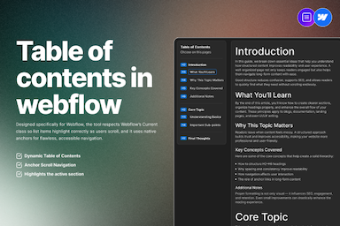
FlowAppz Table of Contents
FlowAppz Table of Contents targets Webflow rich text workflows: generate a styled list that tracks headings without brittle manual IDs.
See Table of Contents and roll it out on your longest help articles first—where navigation pain is obvious.
Editorial habit
Before publish, scan the TOC: if it looks noisy, your outline is probably wrong. A clean TOC is a structural review for free.