


Social share buttons on Webflow: placement, performance, and polish
Share buttons are a layout feature, not an afterthought
When share controls float awkwardly over hero imagery or sit miles away from the headline, readers do not use them. On Webflow, you already have symbols, sticky positioning, and interactions—use them so the share cluster feels intentional: anchored near the title on articles, or in a slim rail on desktop that collapses into a compact row on mobile.
Performance: what actually hurts scores
Third-party widgets often pull extra JavaScript, fonts, and trackers. Even when the network payload is small, late-loading scripts can steal the main thread during LCP. Prefer a solution that:
- Ships minimal JS and reuses your site’s typography.
- Avoids loading five different social SDKs when simple permalinks would do.
- Defers non-critical work until after first paint.
Webflow’s publishing model makes it easy to test: run Lighthouse on a staging domain after you add share UI, compare LCP, CLS, and INP against the pre-share baseline. If CLS jumps, check for icons swapping dimensions or late-inserted iframes.
Which networks deserve a button
Not every site needs twelve networks. Editorial sites often do best with copy link, LinkedIn, and X—plus email for B2B. E-commerce might emphasize Pinterest or WhatsApp. The point is to match intent: who shares this page, and where?
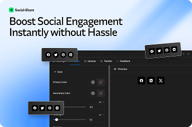
FlowAppz Social Share is built to drop into Webflow with configurable buttons and placement patterns that respect your layout instead of fighting it.
Accessibility and touch targets
Minimum 44×44px touch targets are still overlooked on marketing blogs. Pair icon buttons with visible labels where space allows, or provide tooltips that screen readers can access. Contrast matters when icons sit on tinted cards—test with your actual brand purples, not placeholder grays.
Measuring whether share UI is worth the pixels
Track outbound clicks on share actions in your analytics layer (once consent allows). If numbers are tiny after a quarter, reconsider placement or trim networks. Good share UX is confident and quiet; bad share UX shouts over the content.
Summary
Great Webflow share experiences are designed like any other component: grid-aligned, performant, and tested on real devices. Use a Webflow-native app to keep scripts lean and your Designer workflow intact—see the Social Share product page for install and styling options.