


Jump links, table of contents, and long-form readability on Webflow
Long posts fail when navigation is only scroll depth
Readers on mobile rarely read top-to-bottom on a 3,000-word guide. Jump links give them a map: section names that match real questions, not clever marketing jargon. A table of contents is that map rendered as a compact index—usually near the intro and sometimes sticky on desktop for long technical articles.
Anchors should be stable and readable
Slug-like anchors (#setup-checklist) survive copy-paste into Slack and are easier to support than auto-generated numeric fragments that change when someone inserts a new heading above. If your CMS or Rich Text tool regenerates IDs on publish, confirm anchors remain stable or accept that deep links will rot.
SEO: TOC is for users first
Search engines reward clarity when headings reflect substance. A TOC that repeats keyword-stuffed headings looks manipulative; one that mirrors genuine section titles helps both bots and humans understand structure.
Mobile behaviour matters more than desktop polish
Sticky sidebars that obscure text on small screens hurt readability. Consider collapsible TOCs or an inline list that expands on tap. Test with dynamic toolbars present (iOS Safari).
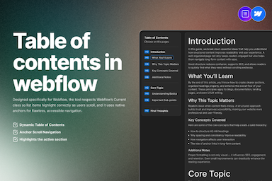
Table of Contents for Webflow Rich Text
FlowAppz Table of Contents generates a styled TOC from Rich Text headings inside Webflow—less manual upkeep when posts change.
See Table of Contents for Designer integration.
Editorial habit
When drafting, write headings as if they were navigation items—because to many readers, they are.
Structure is content. TOC makes structure visible.